6.5 Edmonton AC Loads: Gridded Example#
This worked example will show you how to implement a true “downscaling” method to produce calibrated high-resolution climate projections. Using gridded data for climate impact analysis, instead of one or more point locations, allows you to study the spatial variability in your indicator and its future projections. Some variables may be fairly spatially uniform over the scale of a particular urban region, but others may show significant spatial structure in both the historical climate and the projected changes, due to a number of factors. These small-scale spatial variations can lead to different impacts on different communities. Accounting for spatial variability is important for being able to quantify the unequal effects of climate change on historically marginalized groups of people since populations of ethnic minorities, the elderly, and the disabled are also typically spatially heterogeneous. These groups of people already suffer greater exposure to climate risks, and this inequality could be amplified by unfavourable spatial patterns of climatic changes. Social justice is only one reason why gridded climate projections are useful, but we choose to highlight it here since it is often overlooked in favour of other less human-centred scientific focuses.
6.5.1 Study Design#
This notebook will expand on the examples of Sections 6.1-6.4 and make projections of Cooling Degree Days in a region around the city of Edmonton. To clearly illustrate the value of higher spatial resolution, we’ll use a \(5^{\circ} \times 10^{\circ}\) latitude \(\times\) longitude region centred on the city. This encompasses most of Northern Alberta, but since it extends westward into a region of high elevation and complex topography, it really shows the improvements that can be offered by high spatial resolution.
Like 6.1-6.3, we will use 1980-2010 as the historical baseline period and 2070-2100 as the future projection period. Because of the much larger volume of data that comes with using high-resolution gridded climate data, we’ll return to the scope of Section 6.1 and use only a single model (CESM2) and future scenario (SSP3-7.0).
The gridded observational product we will use in this notebook is the ERA5-Land reanalysis. This is not really observations; it is output from the ECMWF weather forecast model, which assimilates observations. We use this data since the true gridded observational product we used previously in Sections 3.2 and 4.4, the NRCanMet product, does not offer daily mean temperature, which we need to calculate CDDs. ERA5-Land has a spatial resolution of about 9 km \(\times\) 9 km, slightly higher than NRCanMet. More information about ERA5-Land can be found here.
The downscaling method we will employ in this example is “Double Bias Corrected Constructed Analogues”, or DBCCA. This method is explained in detail in Section 4.3.3.2 and Werner and Cannon [2016]. In short, it produces downscaled model output using an optimal linear combination of high-resolution observations (BCCA) with a quantile mapping bias correction step after the fact (DBCCA). Code for both the BCCA and DBCCA methods can be found in the UTCDW GitHub repository in downscaling_code/BCCA.py and downscaling_code/DBCCA.py respectively. Before continuing, please review the aforementioned links and the docstrings for each function in the aforementioned Python scripts, so you can get an idea of how the methods work and how they are implemented.
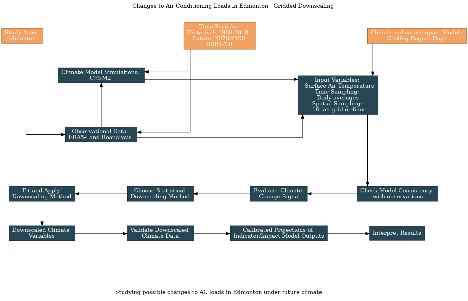
As with the previous examples, here is the workflow diagram, generated using the UTCDW website:
Show code cell content
# add the downscaling_code directory to the PATH so the functions can be imported.
# you will need to change the argument passed to sys.path.append() to be wherever you
# saved the scripts when you cloned the repository or downloaded the scripts individually.
import sys
sys.path.append("/home/mmorris/UTCDW_Guidebook/downscaling_code")

# now import the DBCCA function
from DBCCA import DBCCA

# import other the necessary packages
import numpy as np
import xarray as xr
import dask
import scipy.stats as stats
import matplotlib.pyplot as plt
import cartopy.crs as ccrs
import cartopy.feature as cfeature
from siphon.catalog import TDSCatalog
import pandas as pd
import ec3
import xclim.indices as xci
from xclim.core.calendar import convert_calendar
import gcsfs
import zarr
import os

spkws = dict(projection = ccrs.PlateCarree(), transform = ccrs.PlateCarree())

# spatial boundaries of our study region - a 5x5 degree region around Edmonton
lat_bnds = [50.75, 55.75]
lon_bnds = [-116-2.5, -111+2.5]
lon_bnds360 = [l + 360 for l in lon_bnds]

# lat and lon coordinates for Edmonton
lat_edm = 53.5
lon_edm = -113.5

# time periods for historical and future periods
years_hist = range(1980, 2011)
years_future = range(2070, 2101)

# url for the CSV file that contains the CMIP model data catalog
url_gcsfs_catalog = 'https://storage.googleapis.com/cmip6/cmip6-zarr-consolidated-stores.csv'

# PAVICS URL for ERA5 data
url_pavics_era5 = "https://pavics.ouranos.ca/twitcher/ows/proxy/thredds/catalog/datasets/reanalyses/catalog.xml"
6.5.2 Downloading the Data#
Conveniently, the ERA5-Land data for North America is available from the PAVICS OPeNDAP server, and it can be accessed just the same as the ERA5 data in Section 3.3. The hidden code cells below will download the ERA5-Land data, plus the CESM2 historical and SSP3-7.0 data for ensemble member r10i1p1f1, and subset to select the desired spatial domain and time periods.
Show code cell content
# access the ERA5-LAND data through the OPenDAP server
cat = TDSCatalog(url_pavics_era5)
ix = list(cat.datasets).index("day_ERA5-Land_NAM.ncml")
era5_ds = xr.open_dataset(cat.datasets[ix].access_urls["OPENDAP"])

# subset spatially and temporally
tas_obs = era5_ds.tas.sel(lat = slice(*lat_bnds), lon = slice(*lon_bnds),
                          time = era5_ds.time.dt.year.isin(years_hist))
# convert units
tas_obs = tas_obs - 273.15

# convert calendar to noleap
tas_obs = convert_calendar(tas_obs, 'noleap')
Show code cell content
# download the CESM2 model data from Google Cloud - this code is mostly the same as 6.1

# open the Google Cloud model data catalog with pandas
df_catalog = pd.read_csv(url_gcsfs_catalog)

# search for our selected model, both historical and SSP3-7.0 scenarios
search_string = "table_id == 'day' & source_id == 'CESM2' & variable_id == 'tas'" # continue on the next line
search_string += " & experiment_id == ['historical', 'ssp370']"
df_search = df_catalog.query(search_string)

# filter the search results further for the ensemble member we want to use
df_search_r10i1p1f1 = df_search.query("member_id == 'r10i1p1f1'")

# authenticate access to Google Cloud
gcs = gcsfs.GCSFileSystem(token='anon')

# get the URLs for each dataset and turn into zarr store mappers
url_hist = df_search_r10i1p1f1[df_search_r10i1p1f1.experiment_id == 'historical'].zstore.values[0]
mapper_hist = gcs.get_mapper(url_hist)
url_ssp3 = df_search_r10i1p1f1[df_search_r10i1p1f1.experiment_id == 'ssp370'].zstore.values[0]
mapper_ssp3 = gcs.get_mapper(url_ssp3)

# download the datasets, subset, and convert units
# historical
ds_hist_raw = xr.open_zarr(mapper_hist, consolidated = True)
tas_hist_raw = ds_hist_raw.tas.sel(lat = slice(*lat_bnds), lon = slice(*lon_bnds360)) - 273.15 # also convert to C

# future
ds_ssp3_raw = xr.open_zarr(mapper_ssp3, consolidated = True)
tas_ssp3_raw = ds_ssp3_raw.tas.sel(lat = slice(*lat_bnds), lon = slice(*lon_bnds360)) - 273.15

# select time periods
tas_hist_raw = tas_hist_raw.sel(time = tas_hist_raw.time.dt.year.isin(years_hist))
tas_ssp3_raw = tas_ssp3_raw.sel(time = tas_ssp3_raw.time.dt.year.isin(years_future))
6.5.3 Exploratory Analysis#
6.5.3.1 Model/Obs Consistency#
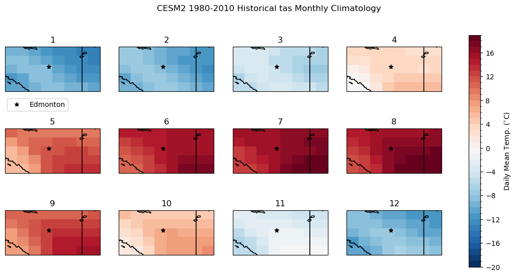
To get a sense of the difference in spatial scale between the raw model data and the high-res ERA5-Land data, we can plot maps using the matplotlib pcolormesh routine. Like before, let’s compare the raw model historical climatology of daily mean temperature to the “observations”. To limit the number of maps, we’ll plot the monthly climatologies instead of the daily climatologies, which we did in the 1D examples. Each panel represents the long-term mean for a different month of the year. The subplot titles indicate the order of the months (i.e. 1 is January, 2 is February, etc.).
Show code cell content
# calculate the raw model historical monthly climatology
tas_hist_raw_monthlyclim = tas_hist_raw.groupby('time.month').mean('time').compute()

# same for observations
tas_obs_monthlyclim = tas_obs.groupby('time.month').mean('time').compute()
# plot model monthly clim
fig, axes_array = plt.subplots(nrows = 3, ncols = 4, subplot_kw = spkws, figsize = (14, 6))
axes = axes_array.ravel()
fig.suptitle("CESM2 1980-2010 Historical tas Monthly Climatology")
for i in range(len(axes)):
    p = tas_hist_raw_monthlyclim.sel(month = i+1).plot.pcolormesh(ax = axes[i],
                                                                  levels = np.arange(-20, 20, 1),
                                                                  cmap = 'RdBu_r',
                                                                  add_colorbar = False)
    axes[i].set_title(i + 1)
    axes[i].coastlines()
    axes[i].add_feature(cfeature.LAKES, edgecolor = 'k', facecolor = 'none', zorder = 2)
    axes[i].add_feature(cfeature.STATES, edgecolor = 'k', zorder = 2)
    axes[i].add_feature(cfeature.BORDERS, edgecolor = 'k', zorder = 2)
    # label where Edmonton is on the map
    axes[i].scatter(lon_edm, lat_edm, label = "Edmonton", color = 'k', marker = "*")

# add legend only to one panel
axes[0].legend(bbox_to_anchor = (0.7, -0.075))
fig.colorbar(p, ax = axes.tolist(), label = r"Daily Mean Temp. ($^{\circ}$C)")
plt.show()
# plot obs monthly clim
fig, axes_array = plt.subplots(nrows = 3, ncols = 4, subplot_kw = spkws, figsize = (14, 6))
axes = axes_array.ravel()
fig.suptitle("ERA5-Land 1980-2010 tas Monthly Climatology")
for i in range(len(axes)):
    p = tas_obs_monthlyclim.sel(month = i+1).plot.pcolormesh(ax = axes[i],
                                                                  levels = np.arange(-20, 20, 1),
                                                                  cmap = 'RdBu_r',
                                                                  add_colorbar = False)
    axes[i].set_title(i + 1)
    axes[i].coastlines()
    axes[i].add_feature(cfeature.LAKES, edgecolor = 'k', facecolor = 'none', zorder = 2)
    axes[i].add_feature(cfeature.STATES, edgecolor = 'k', zorder = 2)
    axes[i].add_feature(cfeature.BORDERS, edgecolor = 'k', zorder = 2)
    axes[i].scatter(lon_edm, lat_edm, label = "Edmonton", color = 'k', marker = "*")

fig.colorbar(p, ax = axes.tolist(), label = r"Daily Mean Temp. ($^{\circ}$C)")
plt.show()

Immediately we can see that the higher spatial resolution of ERA5-Land resolves the effects of the complex terrain and higher elevation along the mountains. Take the months of April (4) and October (10) for example: CESM2 shows slightly colder mean temperatures in the southwest corner of the domain, near zero degrees for a few grid cells. ERA5-Land’s 9 km resolution allows it to resolve the regions of colder and warmer mean temperature in this region, with the higher elevations having negative long-term mean temperatures, and a small valley again showing a positive climatological mean. These features are amongst those we’d like to resolve in the downscaled climate projections.
Next let’s calculate the historical long-term mean CDDs for each grid cell, for the raw model and observations. We can do this using the same function calls as for the 1D station data in the previous examples - the code automatically applies the function separately over each grid cell.
# add unit attribute required by xclim
tas_obs.attrs['units'] = 'degC'
tas_hist_raw.attrs['units'] = 'degC'
tas_ssp3_raw.attrs['units'] = 'degC'

# calculate CDDs for each dataset
cdds_obs = xci.cooling_degree_days(tas_obs).compute()
cdds_hist_raw = xci.cooling_degree_days(tas_hist_raw).compute()
cdds_ssp3_raw = xci.cooling_degree_days(tas_ssp3_raw).compute()

# long-term annual means
cdds_obs_ltm = cdds_obs.mean('time').compute()
cdd_hist_raw_ltm = cdds_hist_raw.mean('time').compute()
cdd_ssp3_raw_ltm = cdds_ssp3_raw.mean('time').compute()
Show code cell source
# plot maps of long-term mean CDDs for raw historical and obs
levels_cdd = np.arange(0, 200, 10)
fig, axes = plt.subplots(ncols = 2, subplot_kw = spkws, figsize = (8, 3))
fig.suptitle("1980-2010 Mean Annual CDDs")
p0 = cdds_obs_ltm.plot.pcolormesh(ax = axes[0], add_colorbar = False, levels = levels_cdd)
axes[0].set_title("ERA5-Land")
p1 = cdd_hist_raw_ltm.plot.pcolormesh(ax = axes[1], add_colorbar = False, levels = levels_cdd)
axes[1].set_title("CESM2 Raw Historical")

fig.colorbar(p0, ax = axes.ravel().tolist(), label = "CDDs", orientation = 'horizontal', extendrect = True)

for ax in axes:
    ax.coastlines()
    ax.add_feature(cfeature.LAKES, edgecolor = 'k', facecolor = 'none', zorder = 2)
    ax.add_feature(cfeature.STATES, edgecolor = 'k', zorder = 2)
    ax.add_feature(cfeature.BORDERS, edgecolor = 'k', zorder = 2)
    ax.scatter(lon_edm, lat_edm, label = "Edmonton", color = 'k', marker = "*")

plt.show()
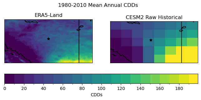
Just like the temperature climatology, the pseudo-observations show much more spatial detail, including topographic effects in the southwest corner of the domain. The coarse resolution of the climate model output prevents it from representing fine-scale features, only capturing large-scale gradients on the order of hundreds of kilometers.
6.5.3.2 Raw Model Climate Change Signal#
Next, we will plot the raw model climate change projections of annual mean CDDs. Later, we can compare this plot to the downscaled projections, to examine the effect of downscaling on the results.
Show code cell source
# plot maps of changes long-term mean CDDs for raw CESM2
levels_cdd_delta = np.arange(0, 750, 37.5)
fig, ax = plt.subplots( subplot_kw = spkws, figsize = (6, 4))

cdd_delta_raw = cdd_ssp3_raw_ltm - cdd_hist_raw_ltm

cdd_delta_raw.plot.pcolormesh(ax = ax, levels = levels_cdd_delta,
                              cbar_kwargs = dict(orientation = 'horizontal', label = 'CDD Change'),
                              cmap = 'Reds')

ax.coastlines()
ax.add_feature(cfeature.LAKES, edgecolor = 'k', facecolor = 'none', zorder = 2)
ax.add_feature(cfeature.STATES, edgecolor = 'k', zorder = 2)
ax.add_feature(cfeature.BORDERS, edgecolor = 'k', zorder = 2)
ax.scatter(lon_edm, lat_edm, label = "Edmonton", color = 'k', marker = "*")

ax.set_title("Raw CESM2 Change in Mean Annual CDDs \n SSP3-7.0 2070-2100 minus 1980-2010")

plt.show()
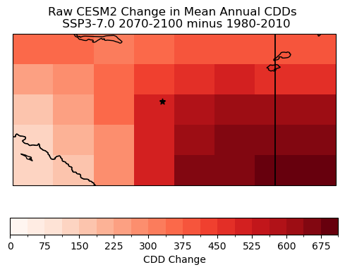
The magnitude of the changes varies quite significantly within the region. Near the centre, where the city of Edmonton is located, the magnitude is of course essentially the same as in Section 6.1 which used the same model and future scenario. However, the southeast region with its higher elevation and overall colder climate shows smaller increases in CDDs, while the southeastern region has an even stronger projected increase than the centre. These large-scale structures will remain in the downscaled projections, but the hope is that the downscaling adds some fine-scale details.
6.5.4 Applying DBCCA Downscaling#
Now it is time to produce our downscaled daily mean temperature data using the DBCCA method. As mentioned, code that implements this method is provided in the UTCDW GitHub repository.
Note
Because of the greater volumes of data involved in gridded downscaling, and the greater complexity of constructed analogue downscaling methods compared to 1D bias correction methods, expect the following code cell to take much longer to run compared to those applying bias correction in sections 6.1-6.4.
In order to save time, you may wish to run the DBCCA downscaling code in a separate script, wait for it to finish running, and then come back and continue working through this notebook when the downscaling is finished. Depending on your computing resources, this could take anywhere from 30 minutes to several hours.
# de-chunk along the time dimension, required by xclim bias correction routines
tas_hist_raw = tas_hist_raw.chunk({'time': -1})
tas_ssp3_raw = tas_ssp3_raw.chunk({'time': -1})
tas_obs = tas_obs.chunk({'time': -1})
# file names for intermediate BCCA files - saving these will help the code run faster later on if all
# you want to do is the last QDM step

file_hist_bcca = "dbcca_data/tas.daily.CESM2.edmonton.historical.r10i1p1f1.1980-2010.BCCA.nc"
file_ssp3_bcca = "dbcca_data/tas.daily.CESM2.edmonton.ssp370.r10i1p1f1.2070-2100.BCCA.nc"

# file paths for DBCCA output - it's good to save this because the code can take a long time to run
file_hist_dbcca = "dbcca_data/tas.daily.CESM2.edmonton.historical.r10i1p1f1.1980-2010.DBCCA.nc"
file_ssp3_dbcca = "dbcca_data/tas.daily.CESM2.edmonton.ssp370.r10i1p1f1.2070-2100.DBCCA.nc"
# open pre-computed DBCCA data if it exists
if os.path.exists(file_hist_dbcca) and os.path.exists(file_ssp3_dbcca):
    ds_hist_dbcca = xr.open_dataset(file_hist_dbcca)
    tas_hist_dbcca = ds_hist_dbcca.tas
    ds_ssp3_dbcca = xr.open_dataset(file_ssp3_dbcca)
    tas_ssp3_dbcca = ds_ssp3_dbcca.tas
else: # do the downscaling - this will only run if the input files don't already exist
    tas_hist_dbcca, tas_ssp3_dbcca = DBCCA(tas_hist_raw,
                                           tas_ssp3_raw,
                                           tas_obs,
                                           "tas",
                                           units = "degC",
                                           fout_hist_bcca = file_hist_bcca,
                                           fout_future_bcca = file_ssp3_bcca,
                                           fout_hist_dbcca = file_hist_dbcca,
                                           fout_future_dbcca = file_ssp3_dbcca,
                                           write_output = True)
6.5.5 Validating the Downscaled Data#
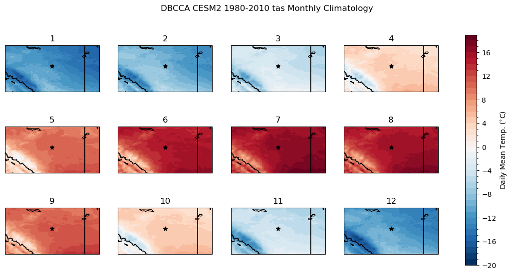
To validate the downscaled data we’ll compare the monthly climatologies to ERA5-Land. First we’ll plot the downscaled monthly climatology, and then the difference between it and the ERA5-Land climatology.
Show code cell content
# calculate the downscaled model historical monthly climatology
tas_hist_dbcca_monthlyclim = tas_hist_dbcca.groupby('time.month').mean('time').compute()

# difference between downscaled and ERA5-Land
bias_clim_dbcca = tas_hist_dbcca_monthlyclim - tas_obs_monthlyclim
Show code cell source
# plot model monthly clim
fig, axes_array = plt.subplots(nrows = 3, ncols = 4, subplot_kw = spkws, figsize = (14, 6))
axes = axes_array.ravel()
fig.suptitle("DBCCA CESM2 1980-2010 tas Monthly Climatology")
for i in range(len(axes)):
    p = tas_hist_dbcca_monthlyclim.sel(month = i+1).plot.pcolormesh(ax = axes[i],
                                                                    levels = np.arange(-20, 20, 1),
                                                                    cmap = 'RdBu_r',
                                                                    add_colorbar = False)
    axes[i].set_title(i + 1)
    axes[i].coastlines()
    axes[i].add_feature(cfeature.LAKES, edgecolor = 'k', facecolor = 'none', zorder = 2)
    axes[i].add_feature(cfeature.STATES, edgecolor = 'k', zorder = 2)
    axes[i].add_feature(cfeature.BORDERS, edgecolor = 'k', zorder = 2)
    axes[i].scatter(lon_edm, lat_edm, label = "Edmonton", color = 'k', marker = "*")

fig.colorbar(p, ax = axes.tolist(), label = r"Daily Mean Temp. ($^{\circ}$C)")
plt.show()
Show code cell source
# plot model monthly clim bias
fig, axes_array = plt.subplots(nrows = 3, ncols = 4, subplot_kw = spkws, figsize = (14, 6))
axes = axes_array.ravel()
fig.suptitle("DBCCA CESM2 1980-2010 tas Monthly Climatology\nBias Relative to ERA5-Land")
for i in range(len(axes)):
    p = bias_clim_dbcca.sel(month = i+1).plot.pcolormesh(ax = axes[i],
                                                                    levels = np.arange(-0.5, 0.5, 0.05),
                                                                    cmap = 'RdBu_r',
                                                                    add_colorbar = False)
    axes[i].set_title(i + 1)
    axes[i].coastlines()
    axes[i].add_feature(cfeature.LAKES, edgecolor = 'k', facecolor = 'none', zorder = 2)
    axes[i].add_feature(cfeature.STATES, edgecolor = 'k', zorder = 2)
    axes[i].add_feature(cfeature.BORDERS, edgecolor = 'k', zorder = 2)
    axes[i].scatter(lon_edm, lat_edm, label = "Edmonton", color = 'k', marker = "*")

fig.colorbar(p, ax = axes.tolist(), label = r"Daily Mean Temp. ($^{\circ}$C)")
plt.show()
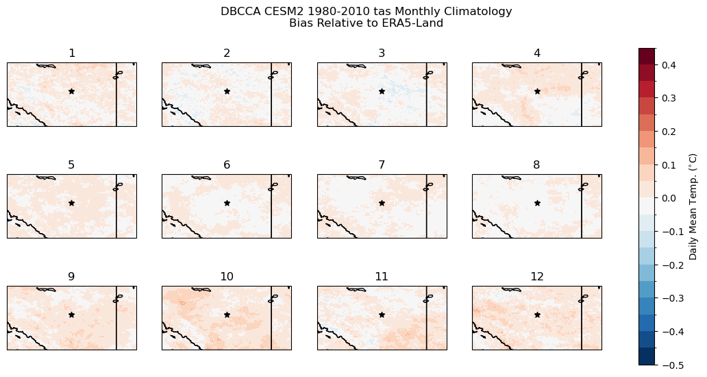
The bias correction steps of DBCCA have done their job well, the climatological bias is on the order of \(0.1^{\circ}\)C for each month of the year. All months except February have a slight warm bias, but the magnitude is not substantial enough to have a major impact on the CDD calculations.
For another validation test, we can do a KS test to ensure the distributions of daily mean temperature are indistinguishable between the downscaled historical model output and the pseudo-observations.
# define a function that returns only the p-value, not the test statistic
get_ks_pval = lambda x,y: stats.ks_2samp(x, y).pvalue

# perform the test at each grid cell
ks_pvals = xr.apply_ufunc(get_ks_pval,
                          tas_hist_dbcca,
                          tas_obs,
                          input_core_dims = [['time'], ['time']],
                          dask = 'parallelized',
                          vectorize = True)

print(bool(np.all(ks_pvals > 0.05)))
True
All of the KS tests at each grid cell have \(p\)-values above 0.05, so we can’t reject the null hypothesis for any of them. This means there isn’t sufficient evidence that the downscaled data is sampled from a different probability distribution than the ERA5-Land daily mean temperatures.
Next let’s calculate CDDs using the downscaled historical data and compare them to the CDDs calculated from ERA5-Land.
Show code cell content
# add units to downscaled data
tas_hist_dbcca.attrs['units'] = 'degC'

# calculate CDDs using the historical DBCCA data
cdds_hist_dbcca = xci.cooling_degree_days(tas_hist_dbcca).compute()

# long-term mean
cdds_hist_dbcca_ltm = cdds_hist_dbcca.mean('time')

# bias of the downscaled data
cdds_hist_dbcca_ltm_bias = cdds_hist_dbcca_ltm - cdds_obs_ltm
Show code cell source
# compare DBCCA historical CDDs to ERA5-Land CDDs
levels_cdd = np.arange(0, 200, 10)
fig, axes = plt.subplots(ncols = 3, subplot_kw = spkws, figsize = (12, 3))
fig.suptitle("1980-2010 Mean Annual CDDs")

# obs
p0 = cdds_obs_ltm.plot.pcolormesh(ax = axes[0], add_colorbar = False, levels = levels_cdd)
axes[0].set_title("ERA5-Land")

# downscaled model
p1 = cdds_hist_dbcca_ltm.plot.pcolormesh(ax = axes[1], add_colorbar = False, levels = levels_cdd)
axes[1].set_title("CESM2 DBCCA Historical")

fig.colorbar(p0, ax = axes[:2].ravel().tolist(), label = "CDDs",
             orientation = 'horizontal', extendrect = True,
             aspect = 30)

# bias
levels_cdd_bias = np.arange(-3, 3, 0.5)
p2 = cdds_hist_dbcca_ltm_bias.plot.pcolormesh(ax = axes[2], add_colorbar = False,
                                              levels = levels_cdd_bias, extend = 'both')
fig.colorbar(p2, ax = axes[2], label = "CDD Bias",
             orientation = 'horizontal', extendrect = True,
             aspect = 15)
axes[2].set_title("Downscaled CESM2 CDD Bias")

for ax in axes:
    ax.coastlines()
    ax.add_feature(cfeature.LAKES, edgecolor = 'k', facecolor = 'none', zorder = 2)
    ax.add_feature(cfeature.STATES, edgecolor = 'k', zorder = 2)
    ax.add_feature(cfeature.BORDERS, edgecolor = 'k', zorder = 2)
    ax.scatter(lon_edm, lat_edm, label = "Edmonton", color = 'k', marker = "*")

plt.show()

The downscaling leaves a small bias in the CDDs, but the magnitude is small compared to the typical number of annual CDDs, except maybe in the southwest corner of the region where there is complex topography. Clearly the downscaling improves the spatial variability of temperature in this region, based on the maps of historical CDDs and the monthly temperature climatology, but a minor bias remains, minor enough to not have a substantial effect on the results.
6.5.6 Downscaled CDD Projections#
Now satisfied with the job done by the downscaling, we can calculate projections of CDDs using the downscaled SSP3-7.0 scenario. We’ll compare this to the raw model projections to illustrate the impact of the downscaling.
Show code cell content
# add units to downscaled future data
tas_ssp3_dbcca.attrs['units'] = 'degC'

# calculate CDDs using the SSP3-7.0 DBCCA data
cdds_ssp3_dbcca = xci.cooling_degree_days(tas_ssp3_dbcca).compute()

# long-term mean
cdds_ssp3_dbcca_ltm = cdds_ssp3_dbcca.mean('time')

# climate change delta
cdds_delta_dbcca = cdds_ssp3_dbcca_ltm - cdds_hist_dbcca_ltm
# plot maps of changes long-term mean CDDs for raw and downscaled CESM2
levels_cdd_delta = np.arange(0, 750, 37.5)

fig, axes = plt.subplots(ncols = 2, subplot_kw = spkws, figsize = (8, 3.5))

fig.suptitle("CESM2 Change in Mean Annual CDDs \n SSP3-7.0 2070-2100 minus 1980-2010")

# downscaled model
cdds_delta_dbcca.plot.pcolormesh(ax = axes[0], levels = levels_cdd_delta,
                              add_colorbar = False,
                              cmap = 'Reds')
axes[0].set_title("DBCCA")

# raw model
p = cdd_delta_raw.plot.pcolormesh(ax = axes[1], levels = levels_cdd_delta,
                              add_colorbar = False,
                              cmap = 'Reds')
axes[1].set_title("Raw")

fig.colorbar(p, ax = axes.ravel().tolist(), orientation = 'horizontal', label = 'CDD Change')

for ax in axes:
    ax.coastlines()
    ax.add_feature(cfeature.LAKES, edgecolor = 'k', facecolor = 'none', zorder = 2)
    ax.add_feature(cfeature.STATES, edgecolor = 'k', zorder = 2)
    ax.add_feature(cfeature.BORDERS, edgecolor = 'k', zorder = 2)
    ax.scatter(lon_edm, lat_edm, label = "Edmonton", color = 'k', marker = "*")


plt.show()
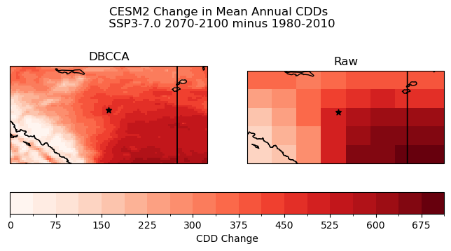
The downscaling has had the desired effect on the CDD projections. Smaller-scale spatial features are present in the downscaled CDD change, including in the mountainous region in the southwest, but also within the large-scale southeast-to-northwest gradient. These smaller features can be important to consider for climate impact analysis. For example, there is a small, oblong region of weaker CDD increase directly to the east of the city of Edmonton (the black star) in the downscaled projections, which could be relevant for city planners to take into account for adaptation planning. This feature is not at all visible in the raw model projections, because the spatial resolution is far too coarse.
A limitation of the current example is of course that we’ve only considered a single model and a single future scenario. The computational cost of spatial downscaling is too high for us to include multiple models, scenarios, and ensemble members in a notebook example, but for a relatively small region like the one examined here, you could feasibly produce statistically downscaled projections for many models and scenarios in a matter of several hours to. a few days, depending on your computing resources. After the downscaling is finished, analysis of the data should be tractable within a Jupyter Notebook.
